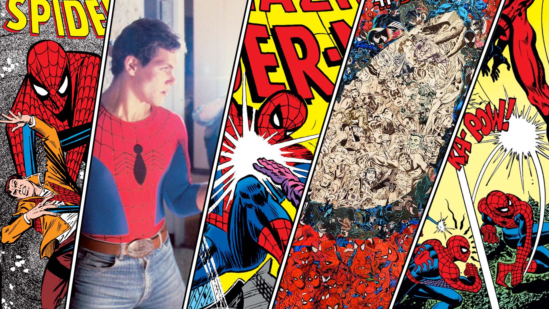
With the new movie Spider-Man: Far From Home out now, we wanted to look back at the source material and all those wonderful Spider-Man-covers that were produced in the past. Michael Minneboo, journalist, vlogger and author of the book ‘Mijn vriend Spider-Man: Superhelden, geeks en fancultuur’ (My Buddy Spider-Man) dove into his huge comic collection and selected his 5 favorite Spider-Man covers.
Spider-Man has been around since 1962. His adventures have been chronicled in multiple series and he’s had many guest appearances in other Marvel series. This means there are hundreds and hundreds of covers featuring your friendly neighborhood crawler. To make the selection process a bit easier, I restricted myself to the main series ‘Amazing Spider-Man,’ thus ‘limiting’ my option to a mere 800 plus issues.
I set up a couple of rules to which a good cover must abide:
1. The main task of a cover is to make the book stand out from the other comics that are displayed, so the potential buyer wants to check the book out. Therefore, the composition must be eye catching.
2. The composition must be clear and readable; the viewer must have a good idea of what is going on.
3. The cover must convey in broad strokes what the story is about: is it a thriller, is Spider-Man fighting a particular villain, is Spider-Man’s secret identity going to be discovered?
4. In line with rule number 1 and 3, the cover must pique one’s curiosity. Maybe a new character is introduced or an interesting scene from the story is depicted. Besides the illustration, captions and other cues might produce this effect.
Of course, these guidelines are open for debate, but I often use these rules myself when judging a book by its cover. However, it doesn’t mean a cover has to abide all these rules to be successful in my opinion.
5. Amazing Spider-Man #700
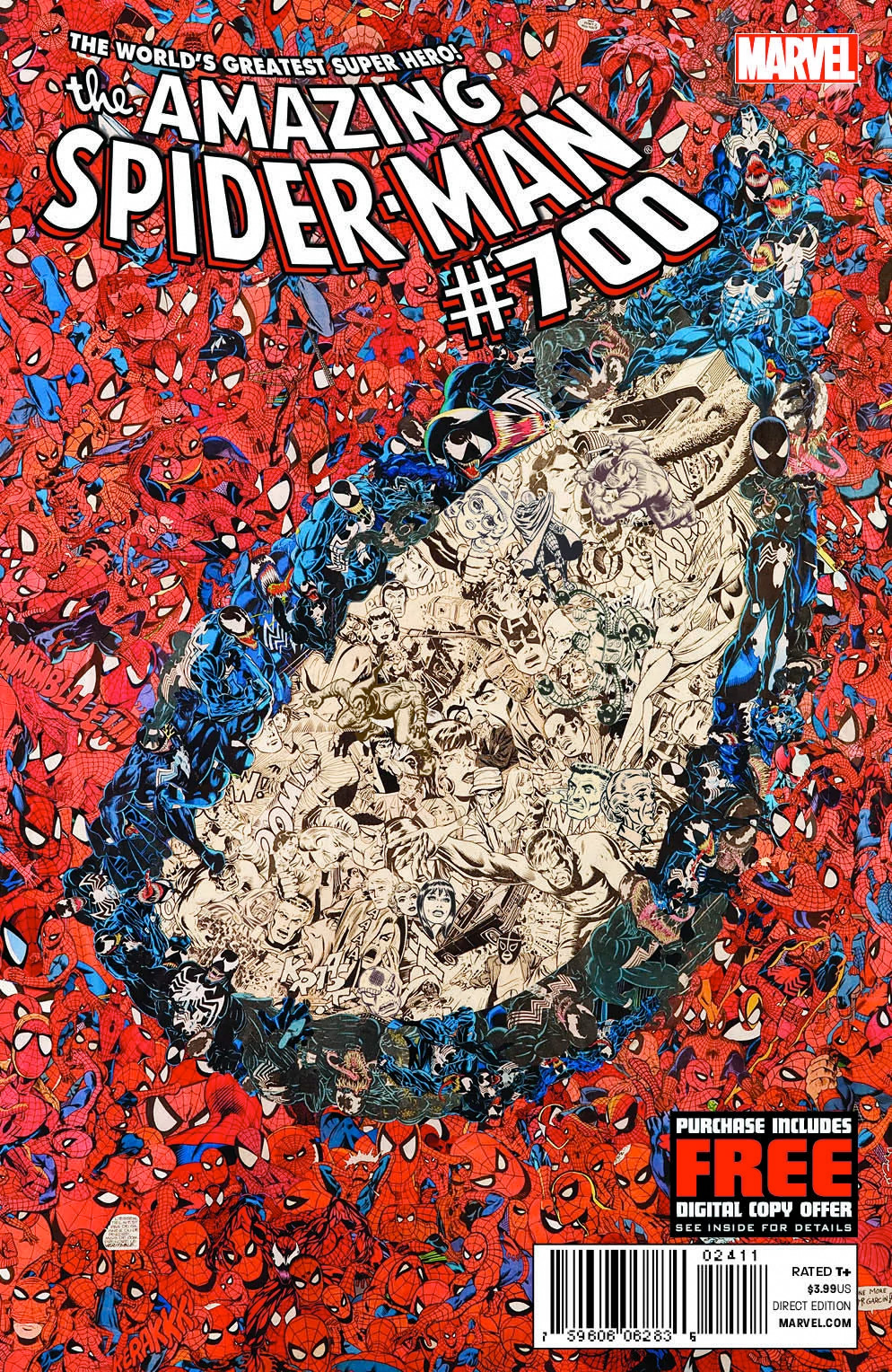
Looking at it from a distance, the cover of Amazing Spider-Man #700 (cover date February 2013) shows a close-up of Spider-Man’s eyepiece. But when we look more closely we discover this image is a collage of hundreds of Spider-Men and other characters from the books.
All pieces are cut-out by hand by French collage-artist Mr. Garcin (http://mrgarcin.com/about-en/). Mr. Garcin has made numerous superhero themed collages in a similar style, but he came to public attention when his Spider-Man collage was used as the main cover of Spider-Man #700. This comic contained the controversial story of the death of Peter Parker after Doctor Octopus forced a body swap. Better not to mention anything about that story ever again.
The cover stands-out as most original and really grabs your attention. At the same time it’s a great visual nod to the 699 issues of Amazing Spider-Man that came before and the creative people who made them. I love studying this collage up close and recognizing the drawing style of particular artists. Every one of them knows how to draw a great Spider-Man and every artist renders the superhero in his own unique drawing style
I did a 2-minute video on the cover of Spider-Man #700.
4. Amazing Spider-Man #262
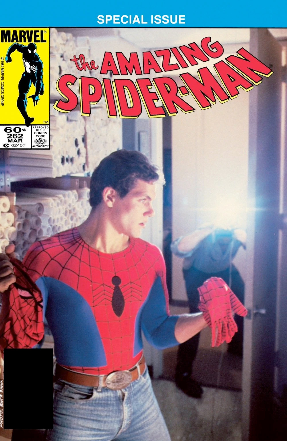
Some Marvel Comics from the eighties feature a photo on their cover. This one from Amazing Spider-Man # 262 (cover date March 1985) is, as far as I know, the only photo cover of this 800-plus issues series.
In the photo we see actor / stuntman Scott Leva posing as Peter Parker who is caught by a photographer when he is changing from Spider-Man into his regular clothes. At the time Leva was hired by Marvel to dress up as Spider-Man for photo shoots and public appearances at comic cons and such places. For a while he was also in the running to play Peter Parker in a Spider-Man film that would be produced by Canon Film. Some test photos of Leva dressed as Parker were shot, but the film was never made.
The cover photo was taken by Eliot Brown, but the idea came from editor-in-chief Jim Shooter. Photo covers are a rarity in the Marvel universe. In addition to this Spidey cover, Marvel Team-up #128 (April 1983) has one with Spidey (shaped by letterer John Morelli) and Captain America (artist Joe Jusko). Spiderwoman #50, Dazzler #21 and issues of The Marvel Fumetti Book also received photo covers. Nowadays Marvel uses photo covers for comics that are released as preludes to Marvel films such as Avengers.
However, none of the others have had the same impact on me as this photo cover with Scott Leva. He looks quite a lot like the way Parker was depicted back then. It’s a great cover that catches your attention because it looks so different from an illustration. The situation is clear in one glance, and will make the reader curious about how Spider-Man will get out of this predicament: an unknown photographer taking a picture of his true face will mean a lot of trouble for a superhero who tries to keep his identity a secret.
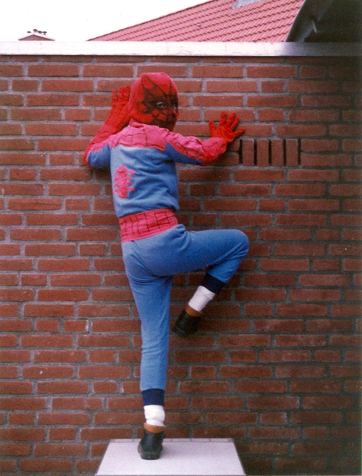
I remember being very happy with this cover when I was a kid, because it was the first view of what Spider-Man’s costume would look like in the real world. And it was just around the time my parents were making a Spider-Man costume for me.
3. Amazing Spider-Man #233
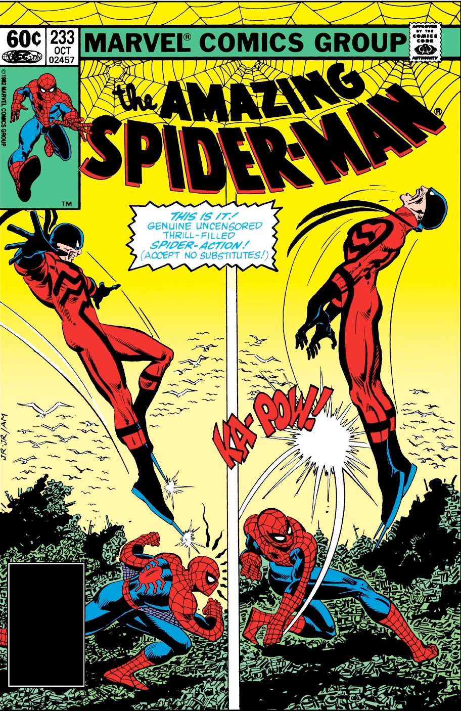
This cover of Amazing Spider-Man #233 (cover date October 1982) by artist John Romita Jr. and inker Al Milgrom, shows us the basics of comic book grammar: two panels depicting one fluent action. Spider-Man’s spidey sense warns that the Tarantula attacks him from behind. In one swift move he turns and punches his enemy, sending him flying backwards.
The composition the illustration is almost symmetrical. And there’s another interesting observation to be made. When studying the illustration closely, we discover that in the second panel the ‘camera’ has turned 180 degrees around the characters. We see the action from the other side.
The yellow background color complements Tarantula’s red suit, making the shape of his body stand out against the background. Quite a clever and action packed cover by my favorite Spider-Man artist. I especially like how Romita Jr. draws Spider-Man’s body language and makes him move. The cover also demonstrates three of Spider-Man’s powers: his Spidey sense, his ability to move very fast and his extra human strength. Of course, the “Ka-Pow!” onomatopoeia emphasizes the force of Spidey’s blow.
2. Amazing Spider-Man #136
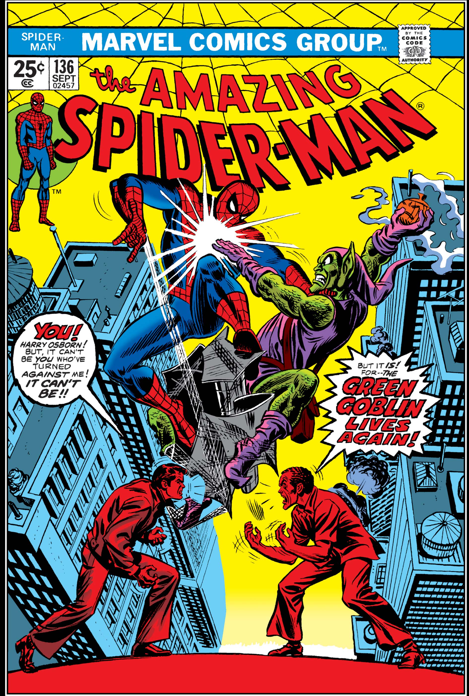
The cover of Amazing Spider-Man #136 (cover date September 1974) is drawn and inked by legendary artist John Romita Sr., who took over the drawing duties on Amazing after Spider-Man co-creator Steve Ditko quit suddenly. Romita made the character even more popular and a lot of people consider his as the ultimate version of Spider-Man.
On the cover we see Peter Parker confronting his best friend Harry Osborn. Their alter ego’s are fighting each other as well, high above New York City’s streets. So, this perfect illustration shows us literally two perspectives on the eternal conflict between Spider-Man and the Green Goblin and therefor between Peter Parker and the Osborns.
Peter and Harry are colored red, emphasizing their heated conflict. Because their alter ego’s are colored in a regular fashion, your attention first goes to Spidey and the Goblin depicted at the center of the composition, and only secondly you notice the characters on the foreground.
Besides containing a great composition and color scheme, the cover also provides some shock value and excitement for regular Spidey-readers. This is the first time Harry Osborn appears as the Green Goblin, after his father Norman Osborn allegedly died in issue #122. Harry blames Spider-Man for the death of his father. For the reader it is a shock to learn that not only has the Green Goblin, or some version of him, returned to make Spidey’s life miserable, it’s also clear Harry knows Peter’s secret identity!
I also want to point out that the dialogue on this cover is very clever. If this would’ve been the first Spider-Man book you ever picked up, not knowing anything about Harry Osborn at all, the situation would still be clear to you thanks to the dialogue.
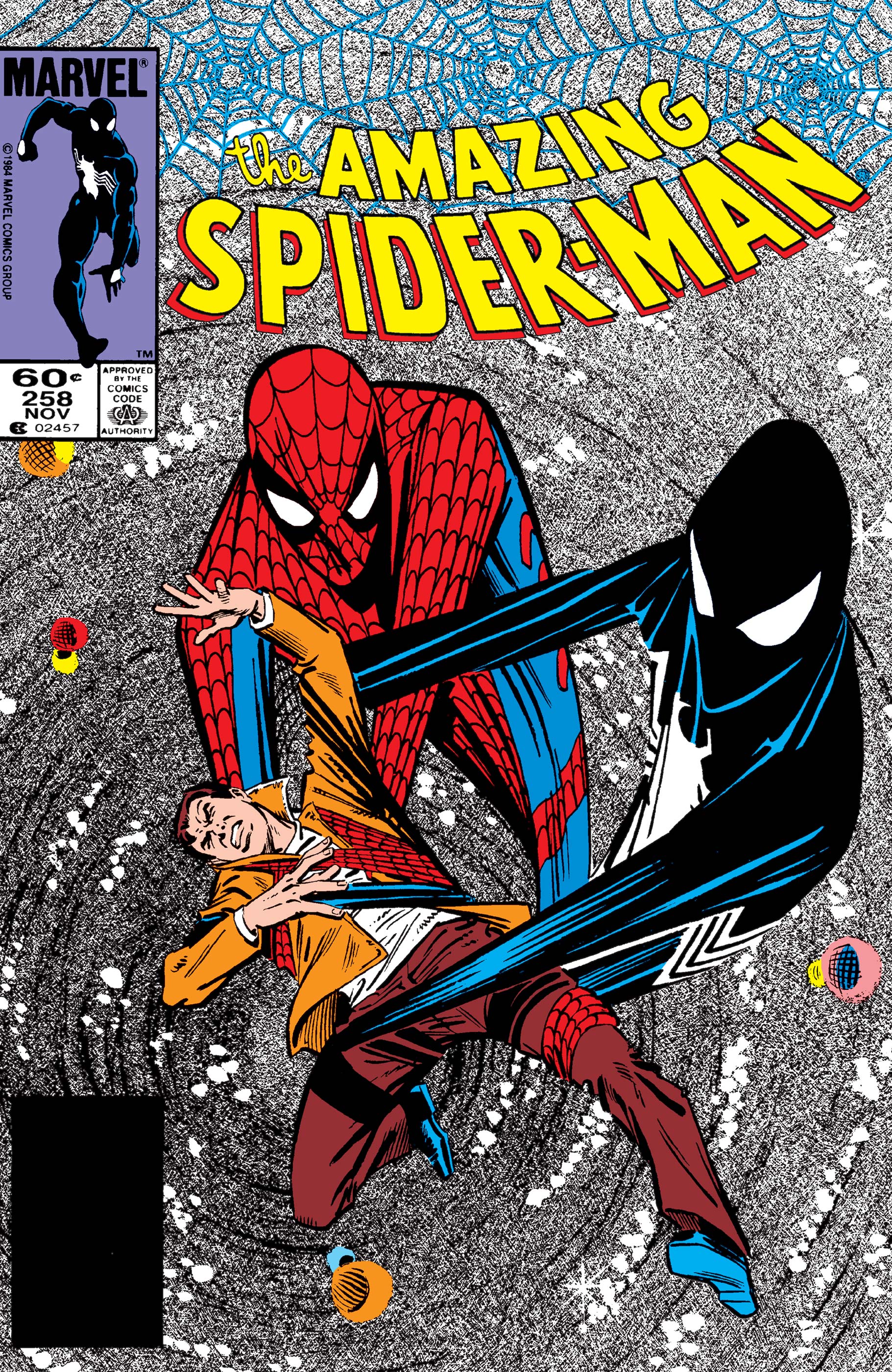
1. Amazing Spider-Man #258
It was very difficult to choose an ultimate favorite, but eventually I picked the cover of Amazing Spider-Man 258 (cover date November 1984), with pencils by Ron Frenz and inks by Josef Rubinstein. Bob Sharen colored the illustration.
On the cover we see how Peter Parker is being held by two versions of the Spider-Man costume: his original red-and-blue costume and the black one – a new addition to Spidey’s wardrobe at the time. The two costumes seem to be fighting over Peter or dragging him into the vortex behind them. The image comes from a nightmare that warns Peter that the new black suit is dangerous. In the comic, Peter discovers that it’s an alien creature that wants to turn him into a living puppet. This fact is unknown to us when we see the cover for the first time.
However, the image is intriguing and makes us curious about what is going on. It is also a very special illustration, because which hero has to fight his own outfit? The cover is somewhat unreal and very original.
Last but not least, Ron Frenz made a striking illustration that catches your eye and draws you in, with the two suits fighting over Peter Parker, and also because of the vortex in the background. Sharen colored the background in grey tones, which makes the colorful figures stand out even more.
Michael Minneboo vlogs in English and in Dutch on YouTube. Check his vlog on the cover of Spider-Man #258.
 Submarine Channel