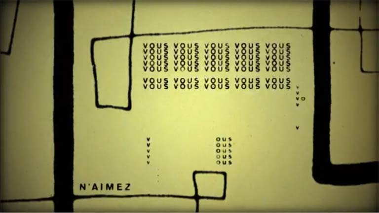
Emanuel Cohen is a Montreal based graphic designer who is currently studying design at the Université du Québec à Montréal (UQAM). This 30 second short was made for a school project. We were really impressed by this piece and the animation style, which lovingly emulates experimental animation from the mid 20th century. There’s definitely a jazzy vibe going on.
Cohen tells us that he’s a “print and typography lover”, who only recently dove into the Motion Design world. “I am trying to play and experiment with type in another level” Cohen explains.
“About the piece… Well it is a school project, so it was open to anything. I recently watched the famous French movie Breathless by Jean-Luc Godard from 1960, and I thought it had extremely rich visual and audio material to work with. The goal of the exercise was to pick any audio sample or recording, and create a 30 second timed/adapted typographic animation. I picked that car scene from the movie, in which Jean-Paul Belmondo is talking to the camera. It’s funny and very ‘colorful’ at the same time.”
Graphically, I attempted to capture the aesthetics of old dusty and shaky film, as well as the old style of animation. The shakiness and quick rhythm of animation also illustrate that ‘in a moving car’ feeling; it is also representative of radio station tuning and searching, where changes are very abrupt and sudden.”
“Most of the elements in this animation are photocopied and scanned old graphic elements. Everything was put together and composed in Adobe After Effects.”
“I really enjoyed working on this project,” Cohen concludes. Will he be doing more motion design projects in the future? “Motion graphics are taking design to a new dimension and I will definitely keep moving in that direction. It is yet another way to express or further develop your style, and it shouldn’t be ignored.”
 Submarine Channel