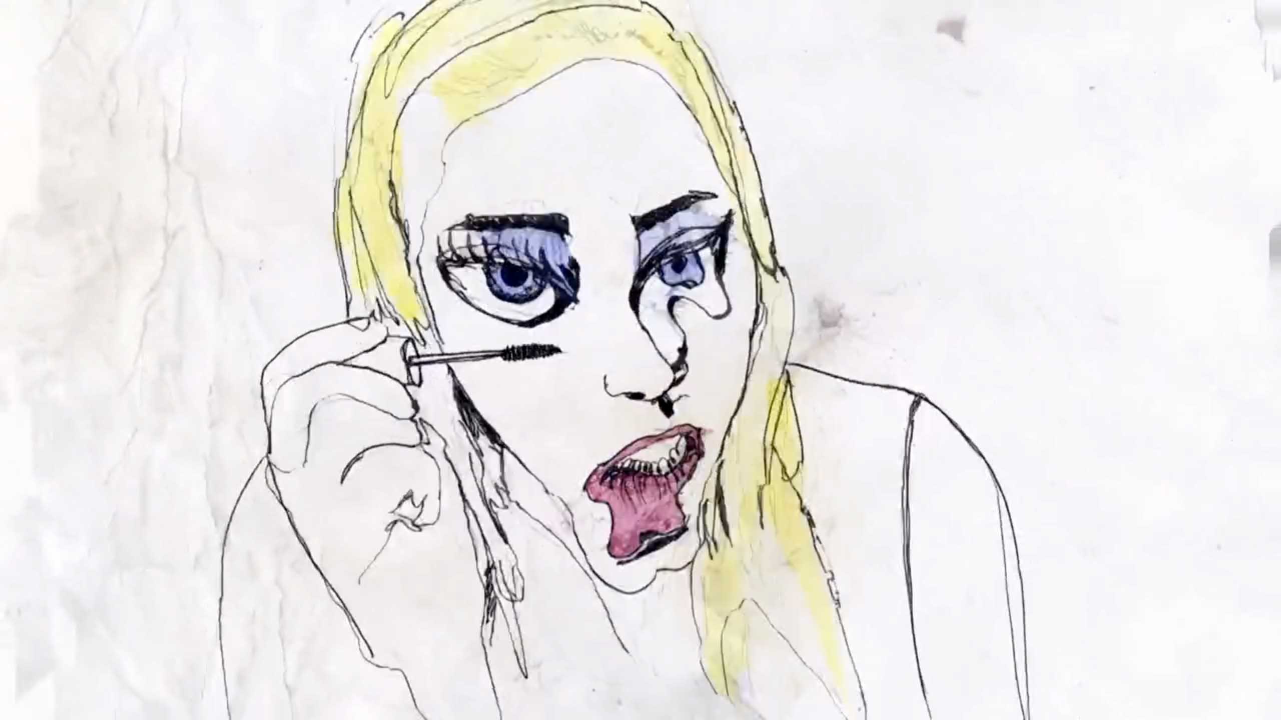
With this Top 5, I want to show that rotoscoping can permanently shed its bad rep as an uncreative, time-saving animation technique.
You’re probably familiar with animated films such as Yellow Submarine (1968), Waking Life (2001), and A Scanner Darkly (2006) – films that use the rotoscoping technique. The process was invented just over a century ago by Max Fleischer, who filmed his brother Dave and then traced the live-action footage frame-by-frame with a pencil. He adapted the animation to match the proportions of a cartoon character he had just created, and voila, Koko the Clown was born.
Audiences everywhere were stunned by the incredibly smooth, lifelike movements of Koko. Years later, Disney Studio also started using the technique. This approach, however, resulted in very naturalistic-looking performances of animated characters – sometimes too realistic. But since the 1980’s, a growing number of directors are using more innovative and experimental approaches to rotoscoping. With some of the films in this Top 5, it’s not immediately apparent that live-action footage was used as the source of the animation. In fact, I’ve had to double check with some of the filmmakers to be sure!
By Iris Frankhuizen
1. A Family Portrait, Dir. Joseph Pierce (2011)
Joseph Pierce mentioned in an interview that he’s not really good at drawing. But after seeing A Family Portrait, that remark seems tangential. Pierce turned his weakness into a strength. All throughout A Family Portrait, Pierce maintains a carefully crafted balance between the real and the surreal. The audience can relate to the characters and the situation – a family photo shoot, whereas the surreal elements allows them to connect with the character’s internal emotional struggles. Pierce uses rotoscoping to visualize important background information about the family dynamics, rather than reverting dialogue to explain things. And it’s this deeper story layer that makes for a stronger film.
2. Club Drunk, dir. Mitchell Crawford (2015)
Maybe this is your usual Saturday night. Maybe not. This animated short lets you experience a chaotic, dazzling night out partying. I’d like to call this “wild rotoscoping.” It’s almost as if the tracing, too, was done in an inebriated state. Mitchell Crawford traces live-action images using wobbly lines. Combined with hallucinogenic visual effects, he manages to visualize a drunk and druggy state of mind. The shaky background emphasizes the party mode. Because of the live-action source material, the audience doesn’t loose touch with the real-life references. Instead of using a traditional story arc, Club Drunk focuses on depicting an atmosphere. After watching this film, you might feel a bit under the influence yourself.
3. How Long, Not Long, Michelle and Uri Kranot (2015)
How Long, Not Long is a unique approach to an animated documentary. The narrative is associative, which is not in line with your average documentary. The use of rotoscoping gives this film a documentary feel. We recognize the historical events from TV, newspapers, history books, and the Internet. Additionally, live-action references were used to visualize everyday rituals from cultures around the world. The limited color palette emphasizes the essence of the images: we only see what really matters. Michelle and Uri Kranot use a painterly style to portray an atmosphere and an emotion. The historical images relating to xenophobia, violence, and intolerance are juxtaposed to images of nature, dance, play, and an abundance of different cultures. Using just images and music, Uri and Michelle Kranot convey their message in a wonderful and poetic way.
4. Na cidade / In der Stadt, Delia Hess (2010)
The Art of Omission! Rotoscoping allows you to delete elements from your image without compromising on recognizability. Delia Hess uses moving squares to suggest a train, and three simple shapes make a car. Less is more in this case. The director depicts her experience of arriving in a new city. Everything is still unknown, so large parts of the image are rendered “incomplete.” Parts of the everyday “urban landscape,” such as patterns, animals, people, and vehicles have been abstracted but their lifelike movements are preserved using the rotoscoping technique. The viewer is challenged to think out-of-the-box and complete parts of the image in their minds, leaving room for their personal interpretation.
5. In Other Words – Tal Kantor (2015)
Another innovative, personal approach to rotoscoping. And another example of the Art of Omission. Tal Kantor shows only what matters story-wise. A man reflects on a lost opportunity to communicate with his daughter. The world around him is visually empty; only what he remembers is visualized. When he reflects on that moment, he sees his daughter. More specifically, he remembers her eyes and arms. Her blaming eyes, her hands that literally play with the words on the table – perhaps the words her father is searching for. The characters are surrounded by words. Live-action and drawn images are combined in this animation that seamlessly blends form and content.
 Submarine Channel
