It’s no understatement to say the journalism industry finds itself in very uncertain times. In the face of declining print sales and the old business model in jeopardy, journalists and editorial teams are having to look beyond the traditional ink and paper approach to storytelling more than ever before. The future of journalism almost certainly lies online but what techniques and approaches will be needed to engage the 21st century reader?
The result of this storytelling exploration so far has produced a slew of long-form, interactive multimedia pieces. Where before a sprawling 7000 or 8000 word-long article would suffice, these new articles pull together photography, interviews, video content, infographics, maps and more; presenting them all as a single unified narrative – often boasting some innovative use of HTML5. This approach aims to give the reader a totally immersive, sometimes even interactive experience.
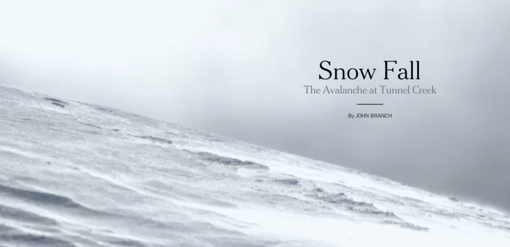
The most high-profile of these pieces has surely been the New York Times’ Snowfall: The Avalanche at Tunnel Peak. While by no means the first of its kind (take a look at the Philadelphia Inquirer’s Black Hawk Down piece from way back in 1997) , it made waves when it went viral back in December 2012 and has quickly become the poster boy for this new brand of digital long-form journalism.
Written by the Times’ Pulitzer Prize-winning writer, John Branch, it’s an epic retelling of a tragic, ill-fated ski trip that combines photographs, video interviews, moving graphics topped off with an in-trend parallax design. The result was impressive; in the six days following its release, the Times website saw an influx of 3.5 million page views.
Snow Fall went on to win the Times that year’s Pulitzer Prize and Executive Editor Jill Abramson has said that the influence has now spread so far that to snow fall has even become a verb in the Times’ editorial office.
It didn’t take long for people to begin hailing Snow Fall as the ‘future of journalism’ . But producing features like this is neither cheap nor easy and where Snowfall succeeds in elevating the narrative, others have failed. Perhaps it will be the steady march of new storytelling tools such as Creatavist and scroll kit – that remove the need for hours upon hours of coding – that will be key in moving the format forward.
In the meantime, here are five examples that have impressed us. As always, if you think there’s something missing from our list, we’d love to hear about it: drop us a line via Twitter @submarinechannl
1.) The NSA Files: Decoded
The Guardian are certainly no strangers to producing multimedia experiences of their own. Their Firestorm piece earlier this year, an in-depth look at an Australian family trapped by a bushfire, was brilliantly executed and one of the paper’s most ambitious forays into long-form journalism to date. Their follow-up, this September 2013 piece on the revelations made by Edward Snowden, just edges it for us. In explaining the repercussions of the NSA files, they provide a consummate combination of text, photographs, video interviews with experts and interactive tools that allow you to explore your own data.
2.) A Game of Shark and Minnow
Back to the New York Times Magazine now for this fascinating piece about a political drama building in a remote area of the South China Sea. A Game of Shark and Minnow was designed with the aim to keep the reader active throughout the experience. As a result, there’s no stopping to press play on a video and sitting back; instead the whole article is navigated by scrolling through the piece. The narrative is accompanied by moving images, stunning photographs, moving maps and graphics, all of which immerses you in the world of this remote but contentious part of the world.
3.) Killing Kennedy
Over to National Geographic now with a deviation from the Snowfall-style but one that’s too good to leave out. Released to coincide with the 50th Anniversary of the Kennedy Assassination and as a companion to a television movie of the same name, Killing Kennedy is a sprawling interactive documentary that tracks the lives of both John F. Kennedy and Lee Harvey Oswald. While it is far removed from the others in this list in terms of style and design, Killing Kennedy brings together a wealth of multimedia (including beautifully rendered photographs, graphics, narrated audio segments and videos) with comparatively little text and a scrolling parallax design to deliver an arching narrative on the lives of Kennedy and Oswald, all of which builds to that infamous Friday in Dealey Plaza.
4.) The Geeks On The Frontline
The Geeks On The Frontline is a Rolling Stone piece by David Kushner and produced in collaboration with HTML Hub, a new developer community sponsored by Intel. It delves into the life of hackers and in particular how the government and industry are competing for their expertise. Kushner’s story is brilliantly interwoven with the imagery of photographer Charles Ommanney and some very interesting HTML5 design.
5.) Machines For Life
In May 2013, it was the turn of Daft Punk to be Snow Fall’ed, as part of a piece featured in Pitchfork ahead of the release of their latest album Random Access Memories. The article was aimed at offering a rare glimpse into the secretive lives of Thomas Bangalter and Guy-Manuel de Homem-Christo and does so with a strong multi-media aspect. As with the previous piece, Pitchfork made great use of HTML5, GIFs and a parallax layout to keep the reader hooked.
 Submarine Channel


I’m a huge fan of this style of long-form journalism. I think it is a terrific way for traditional journalism to stay relevant.
What are others’ thoughts on the resources it takes to produce such an article? Does that limit its effectiveness for smaller news organizations? Is there a way to open-source aspects of such articles’ construction?